
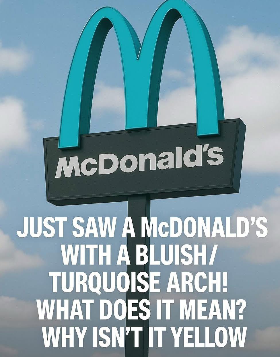
The city required muted, earth harmonious tones for exterior signage.
Turquoise was selected because it complements, rather than fights, the red rock backdrop.
The change made the restaurant a genuine local curiosity and a favorite photo stop for travelers.
Why Turquoise Works So Well
There is real design logic behind the choice. Red and turquoise sit near opposite ends of the color wheel, so the cool blue green tone provides gentle contrast without overwhelming the warm tones of the cliffs.
Instead of a jarring corporate billboard, the building reads as part of the scenery. Visitors often say they barely notice the restaurant until they are right beside it, which is exactly the point.
Turquoise also carries deep cultural meaning across the American Southwest. For generations it has symbolized protection, healing, and connection to the land. By adopting that hue, even unintentionally, the restaurant tapped into a color that already belonged to the place it was joining.
What It Teaches Us About Respecting Place
The turquoise arches endure as a small but powerful reminder that no brand is too big to bend for the good of a community.
When a global company set aside one of the most protected logos in the world to fit the spirit of a single town, it showed that identity and flexibility can coexist.
The lesson reaches far beyond fast food. Whether we are building a home, opening a business, or simply visiting somewhere new, we can choose to honor what makes a place special instead of imposing ourselves upon it.
Sedona asked a giant to listen, and the giant listened. The next time you spot those unusual turquoise arches glowing against the red rocks, remember the quiet victory they represent: proof that beauty, humility, and respect for place are always worth standing up for.
